Geeks And Gamers Premium Ad
Geeks + Gamers › Forums › Support & Feedback › Forum Suggestions › Geeks And Gamers Premium Ad
Tagged: G+GPremium, GeeksAndGamers, PopUpAds
- This topic has 27 replies, 11 voices, and was last updated 3 years, 10 months ago by
 DDayCobra.
- AuthorPosts
- April 5, 2021 at 6:31 pm #216447
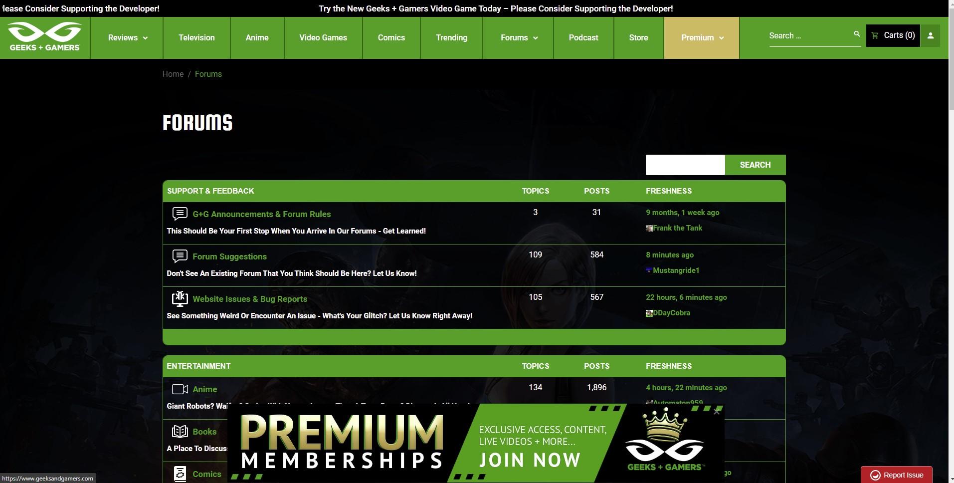
Hi G+G, noticet the new pop-up ad for premium membership
I know it’s important to advertise, promote, and support G+G by becoming a premium member, but, as much as i’d like too become one, momantarily, i’m broke AF
, and in all honesty… pop up ads are very annoying
So, could i just leave a sugestion regarding the premium ad?
Current pop-up ad:
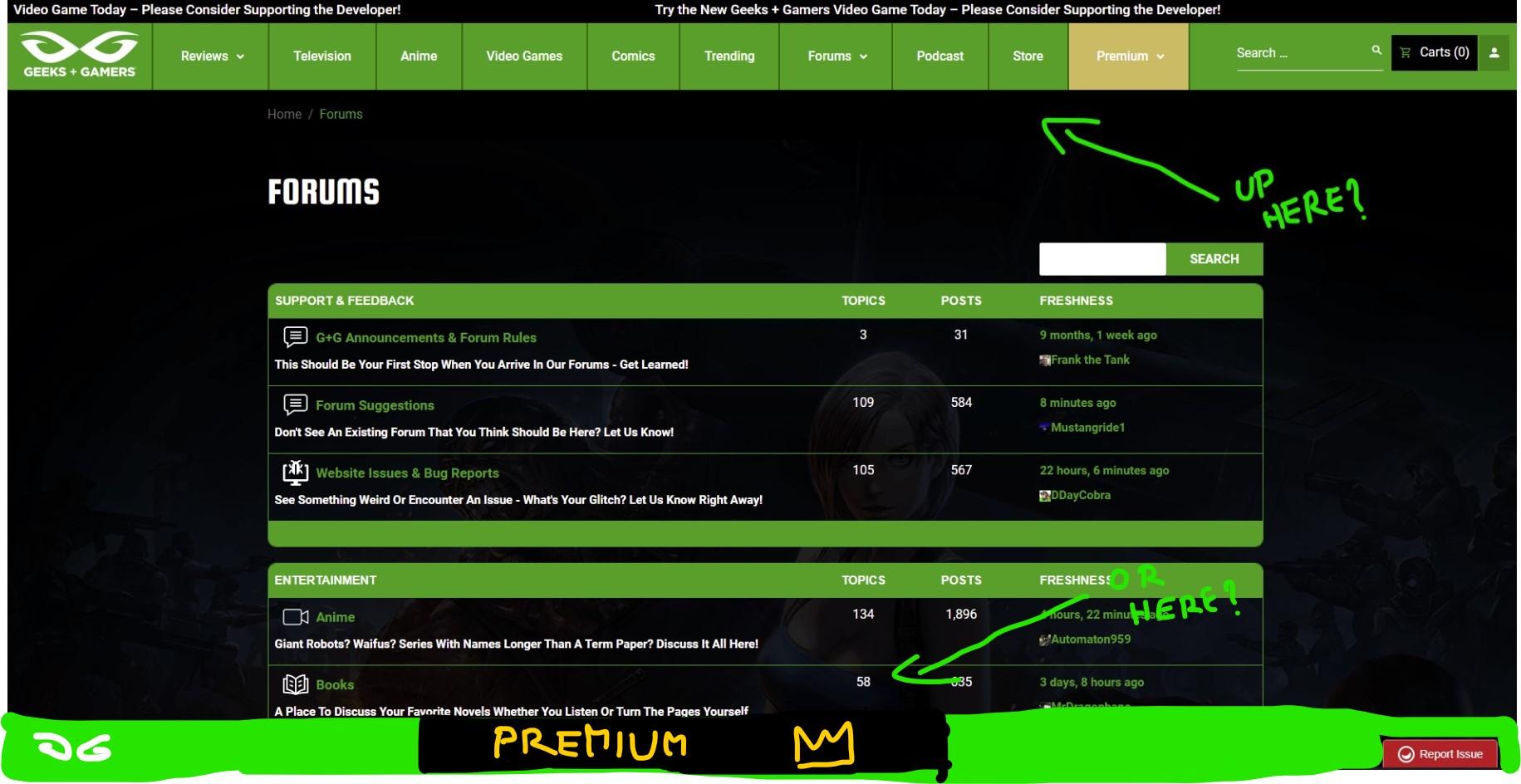
Where ad could go:
(don’t mind my crappy computer doodles
) I was thinking, there’s already a banner on top of the site, could the ad go up there? Or would it be possible to make a propper banner at the bottom, not right at the bottom, but it stays there even when scrolling, just an idea
I will admit, i have no idea how any of this works, but if it’s feasible, i think aesthetically the ad would look better having it’s own permenant space rather than being a pop-up, or if it needs to be a pop-up ad, could it be one in disguise??
The pop-under advertisement is a variation of the pop-up ad, where the advertisement appears under the active screen, rather than on top of it.
Ok, just learnt it’s probably a pop-under ad, which is just as annoying as the pop-up ad
- This topic was modified 3 years, 11 months ago by
 DigiCat.
April 5, 2021 at 8:20 pm #216464Agreed that thing is annoying.
Make it stay away when closed.
April 5, 2021 at 8:39 pm #216469Yap, this is not how you want to improve and attract people to the forum. You could make it that just pops up once for each ip. But popping up in every page every time. wtf.
April 6, 2021 at 1:39 am #216482Worst thing about it is that I became a Premium member before that ad banner showed up, and it still appears on my screen every page. I paid already, so why should I have to see this. This is a pet peeve I have with any site, is banners and pop-ups. It’s never what I am on a site for. Would also say that if G and G wants more money, make it easy for supporters and get a Cash App or a Venmo.
April 6, 2021 at 5:40 am #216491We’re all kinda here already. We see the Premium tab at the top of our screen. This banner, while being consistently annoying, also feel redundant. I’d leave advertising it so aggressively to G+G videos where someone new might actually need the knowledge. Like I said, we’re all here already, we’re clued in, and those of us able to work it into our budgets have already subbed.
- This reply was modified 3 years, 11 months ago by
 Roas.
Roas.
April 6, 2021 at 6:28 am #216497Pop-ups are as annoying as SPAM and a great way to run-off potential members.
April 6, 2021 at 9:34 am #216515Id spam the fuck out of Twatter, Blotube, ot Fascist dork with this.
We are alredy here like already mentioned.
April 6, 2021 at 7:05 pm #216563It’s Javascript… turn it off and its gone.

- This reply was modified 3 years, 11 months ago by
 Mustangride1.
April 6, 2021 at 8:53 pm #216570this is boomer marketing … just fix it already pls…
make intros promoting premium stuff in the videos, post it on twitter, IG stories, etc… but this 90’s pop up ad…. it ain’t it chief.
April 7, 2021 at 10:43 am #216615I agree with everyone here. The pop-up ad is annoying for users that are already premium members and those who are not will view the pop-up ad as in your face marketing for premium membership. I would suggest that the Geeks and Gamers team create a forum for advertising premium membership, intro videos or outro videos on their YouTube channels for premium memberships, or place the pop-up advertisement above the header and navigation bar for the Geeks and Gamers website for specific pages related to premium membership. I enjoy being a premium member, but the pop up advertisement feels forced for both premium members and normal members.
April 8, 2021 at 12:03 pm #216725If I could, I would but unfortunately it won’t happen. You’ll just have to settle for me in your corner. Sorry if that’s not enough but it’s all I can offer.
As for moving where it appears, I agree with gold- This reply was modified 3 years, 11 months ago by
Loken.
April 8, 2021 at 1:22 pm #216737If I could, I would but unfortunately it won’t happen. You’ll just have to settle for me in your corner. Sorry if that’s not enough but it’s all I can offer.
As for moving where it appears, I agree with gold???
April 8, 2021 at 1:32 pm #216739Join premium and contribute to geeks and gamers
April 9, 2021 at 1:53 pm #216880If you want to drive away users, then you are on the right track.
April 9, 2021 at 3:26 pm #216903Jeremy clearly has not been to the forums in the past few days to see this, so FNT chat needs to get on him tonight to get rid of this thing.
- This topic was modified 3 years, 11 months ago by
- AuthorPosts
- You must be logged in to reply to this topic.


